Flor de Linês
Invited by two sisters, founders and work partners, to develop the identity system for Flor de Linês, an atelier in Sete Lagoas, Minas Gerais, Brazil, that crafts refined makeups and hairstyles.
Considering the brand's personality, local space, clients, and services, the project's challenge was to create a sophisticated yet organic brand that is human and intimate.
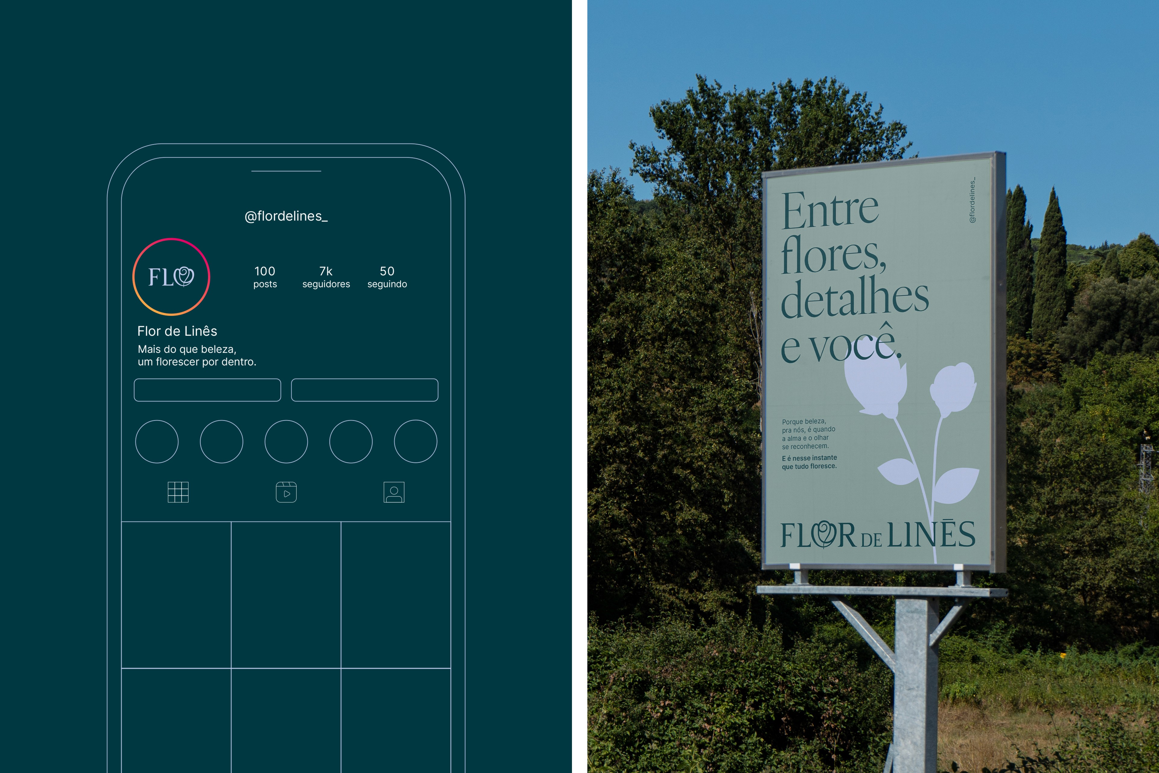
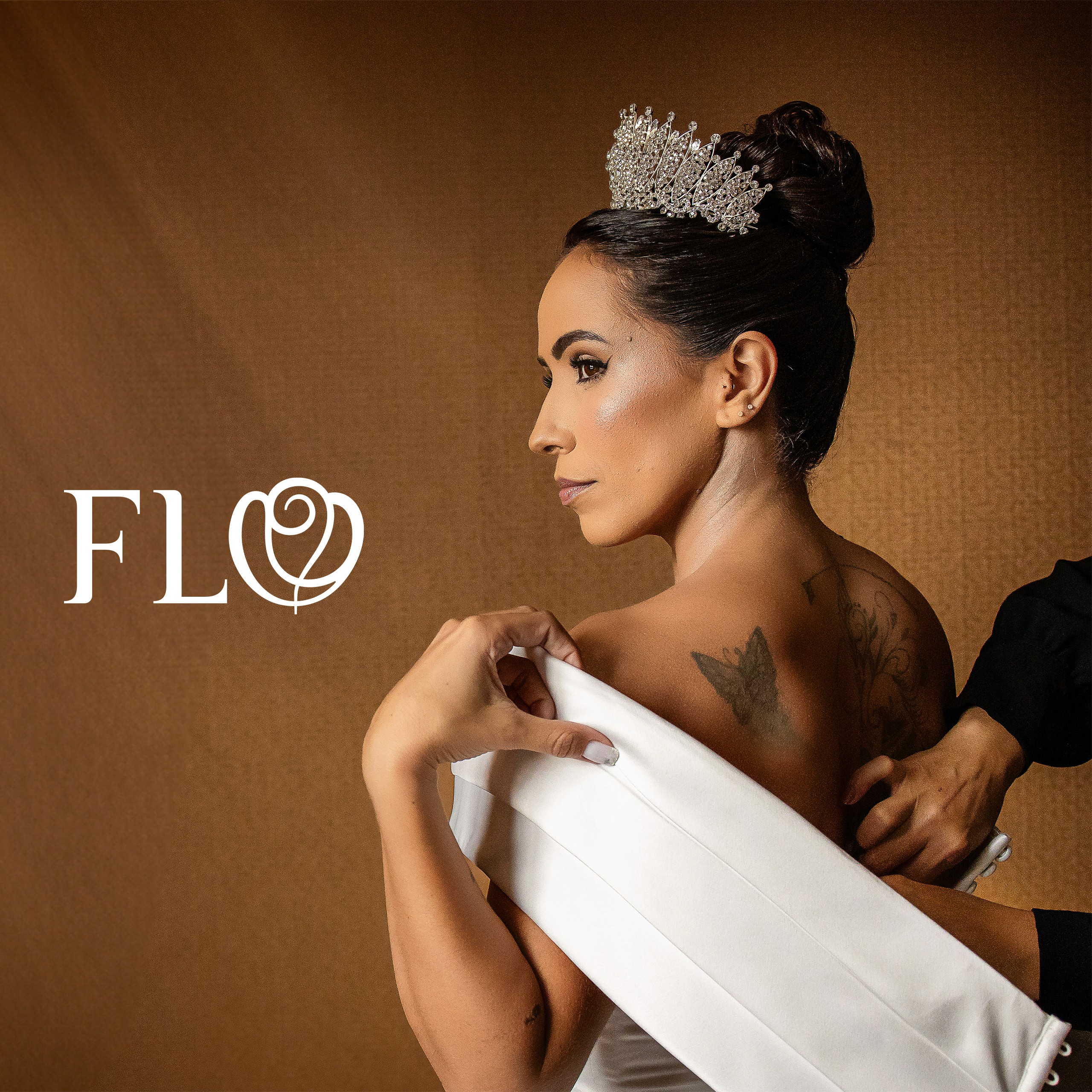
The creative idea was to implement an organic flower's symbol, rounded enough to make the letter "O" readable, and the full logo unforgettable. The Logo reduction "FLO" was inspired by the regional characteristics of this specific state in Brazil. Minas Gerais is well-known for the contraction of Portuguese words and sentences, so it is very common to call a flower "Flo" instead of "Flor" in the state's Brazilian Portuguese. At the same time, the reduction serves as an acronym for the business name, transforming the brand's identity in deep, emotional ways, rooted in the founders' history.
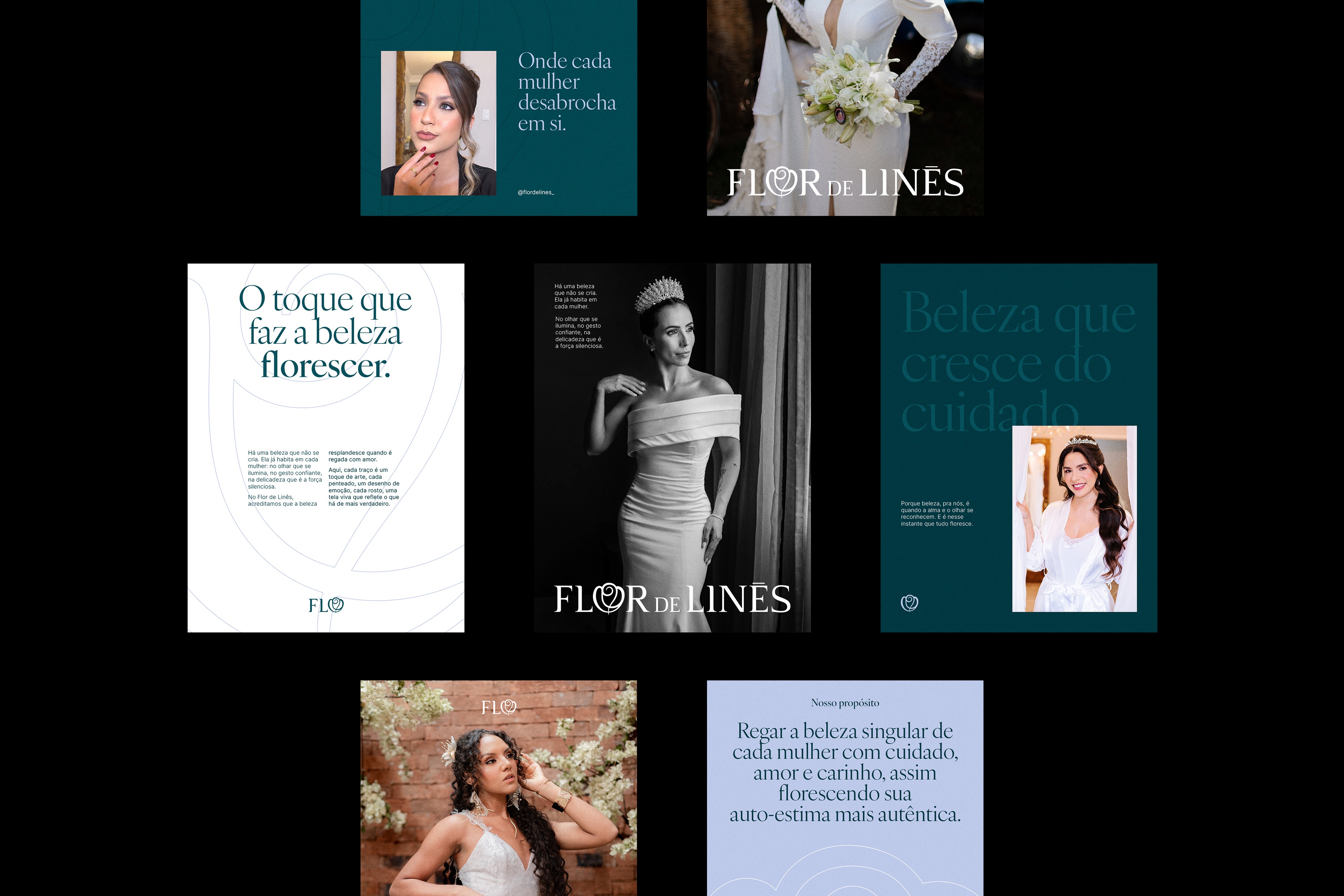
During the Diagnosis and the Briefing step, we noticed the need for an identity system having the atelier and their personal brands, regarding a product line in the near future as well. Consequently, the system has multiple layers, with a brand architecture for the business holding and its personal brands, all connected by the same creative concept and exclusive letterforms, unifying and elevating communication across all identities (atelier, makeup, hairstyle, and future products).
The color system was carefully developed from Pantone tones, reflecting the brand's personality, nature, and feminine audience, while assertively differentiating the atelier in the competitive landscape. The typographic system is human and legible, with a display serif headline connected with the logo's creative concept, and readable body and small texts. So, this system was particularly charming to both clients and the target audience, unifying the business's core with the verbal and visual statements.