mo.studio Arquitectura Integral

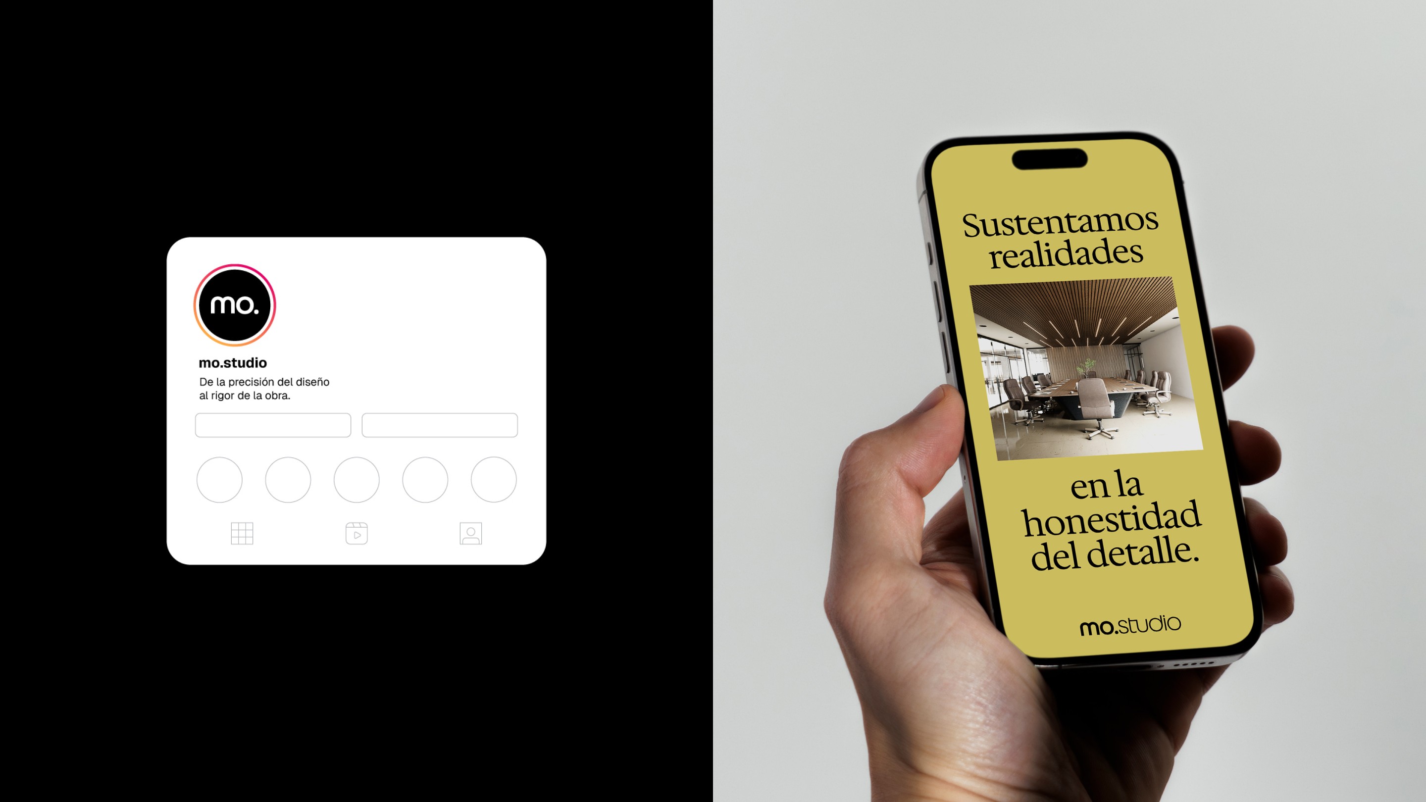
Recently, I partnered with the architect and founder of ‘Materialidad Objetiva Studio de Arquitectura Integral’ (or simply mo.studio) from Cuenca, Ecuador. The challenge was to translate the company’s core business into a brand strategy and valuable visuals to position the brand in a highly competitive market.
The company's medium- and long-term goal is to grow locally in Ecuador and then expand into the Latam and Spain architecture and construction market. After workshops with the client on strategy and visual direction, I adopted the central creative idea he and the other 2 members of the society presented to me:
1. Lowercase capitals on the logotype represent ‘quiet confidence’, where the spaces, materials, and details speak for themselves.
2. The arch letter ‘m’ with a continuous stroke stands for the 3 pillars together (design, management, and construction), and the 3 partners.
3. A neutral BW architectural look, which has no fear of colors, symbolizes the whole range of materials, textures, and details.
Therefore, I created a bespoke logotype inspired by classic early geometric sans-serifs—such as Futura and Avant Garde—and developed a grounded brand system that combines human expression with a modern, compelling approach.
Design & Art Direction: Sato Mateus
Motion Design: Emanuel da Costa