About
A company that has been in the Dutch market for 3 years, providing massotherapy services to hotels and spas in the capital, Amsterdam. Starting a new moment for the firm, the name Yacy appears to debut the new business model, focused on the female audience, especially pregnant women and proactive women of different ages; With the acquisition of its own physical space, it aim to grow and secure great relevance in the European scenario of women’s well-being and health, therefore the business owner contacted our studio to develop the brand strategy and design.
Yacy's brand is idealist, serious, modern, sophisticated and organic. The brand's differential is your in-depth knowledge of traditional physiotherapy, combined with the sensitivity to identify and tailor-made a treatment for each patient, based in their physical need.
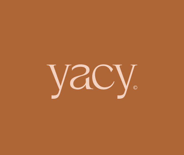
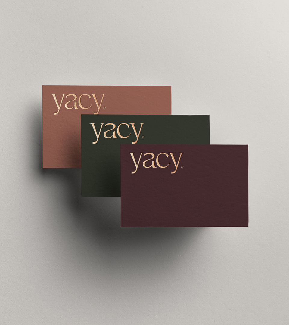
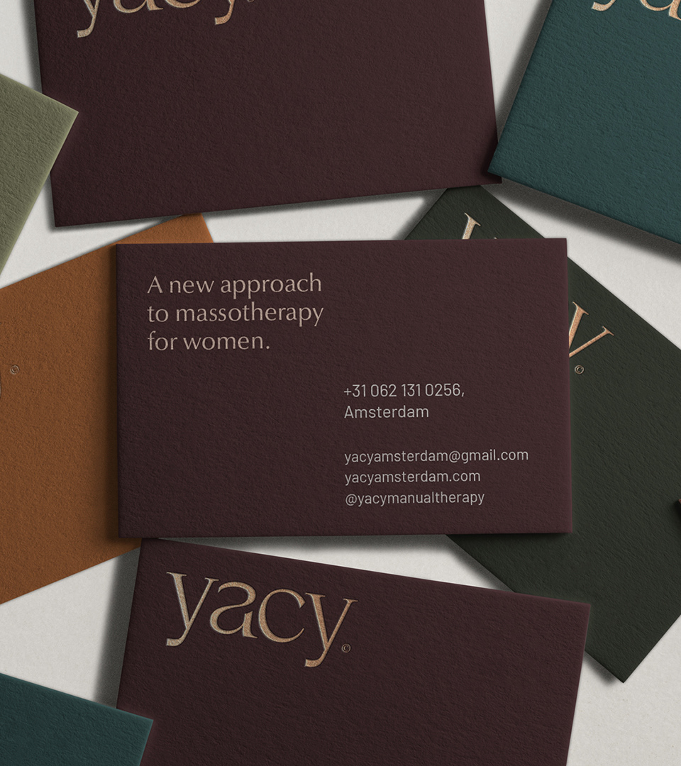
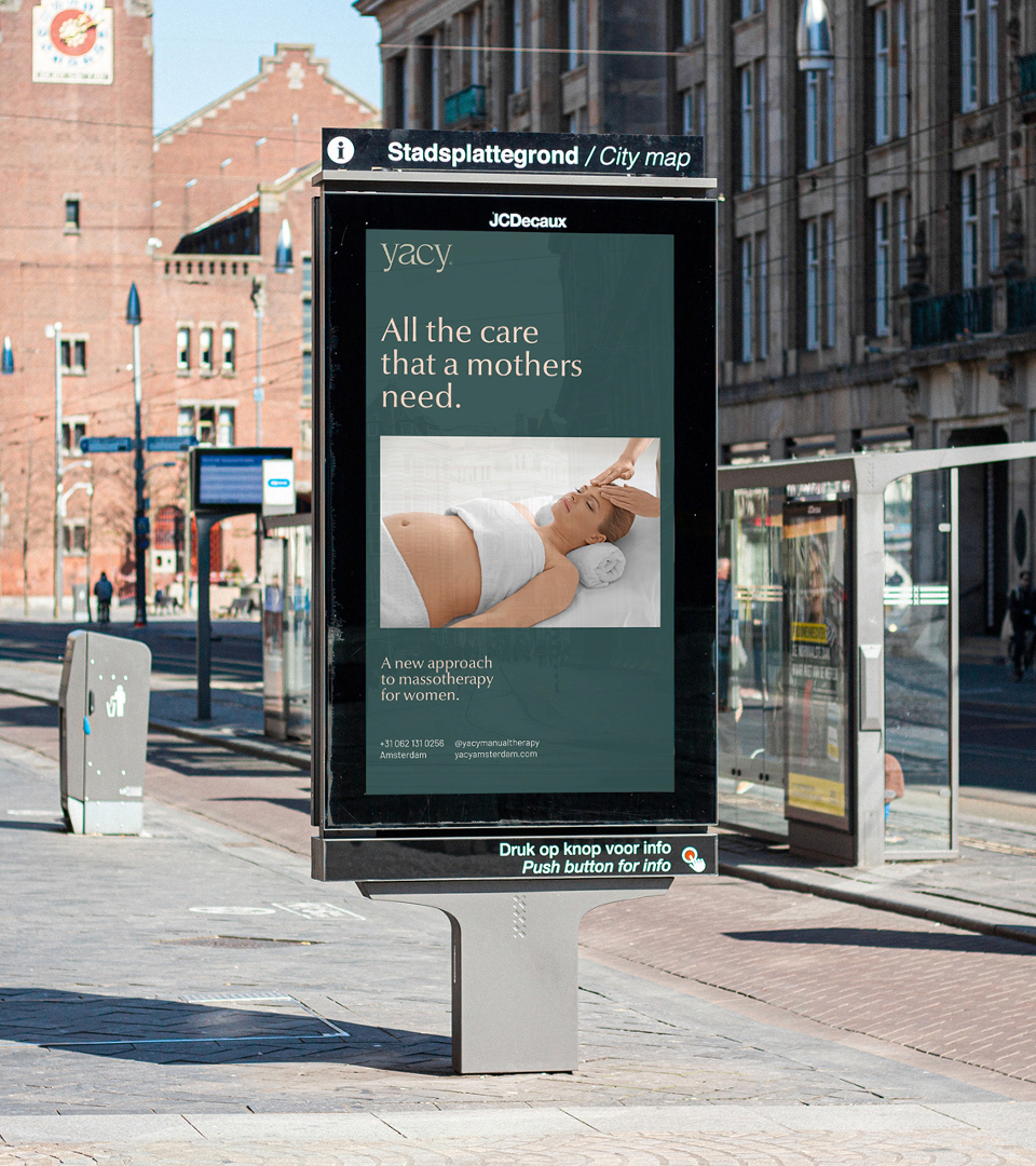
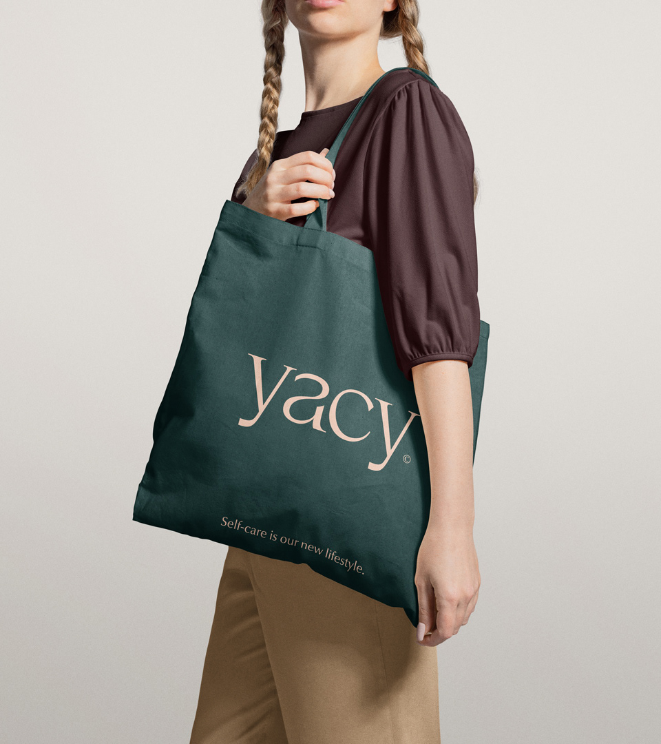
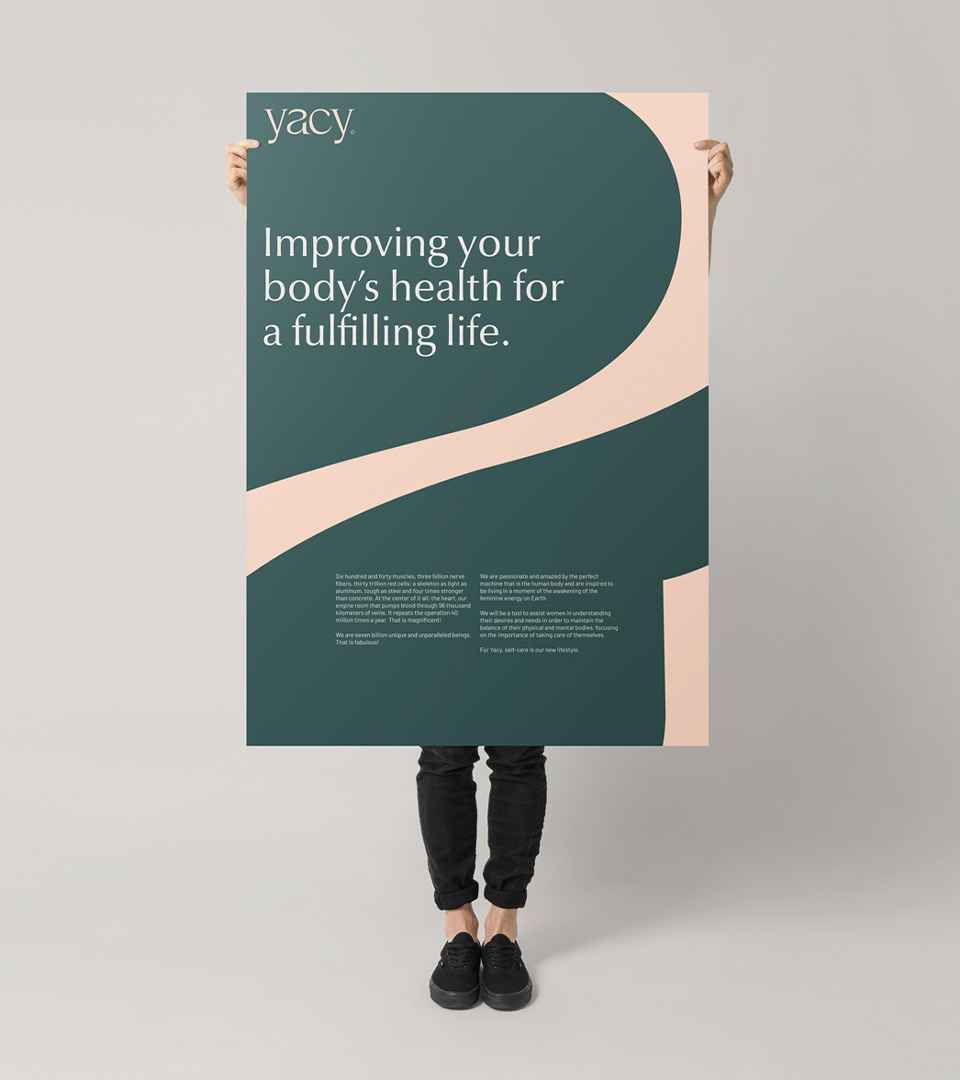
Client and studio agreed to escape from the cliche used in the health and wellness segment, which typically use lotus flower logos and alike. For Yacy, we designed an exclusive lettering and a 100% typographic logo, we also brought nature in the brand's photographic style and in natural tones of the color palette, thus elaborating a unique brand that presents the niche market's attributes, but in an original and innovative way.
Deliverables
Strategy, Identity, art direction, graphic design, motion, Brand Book.
