

About
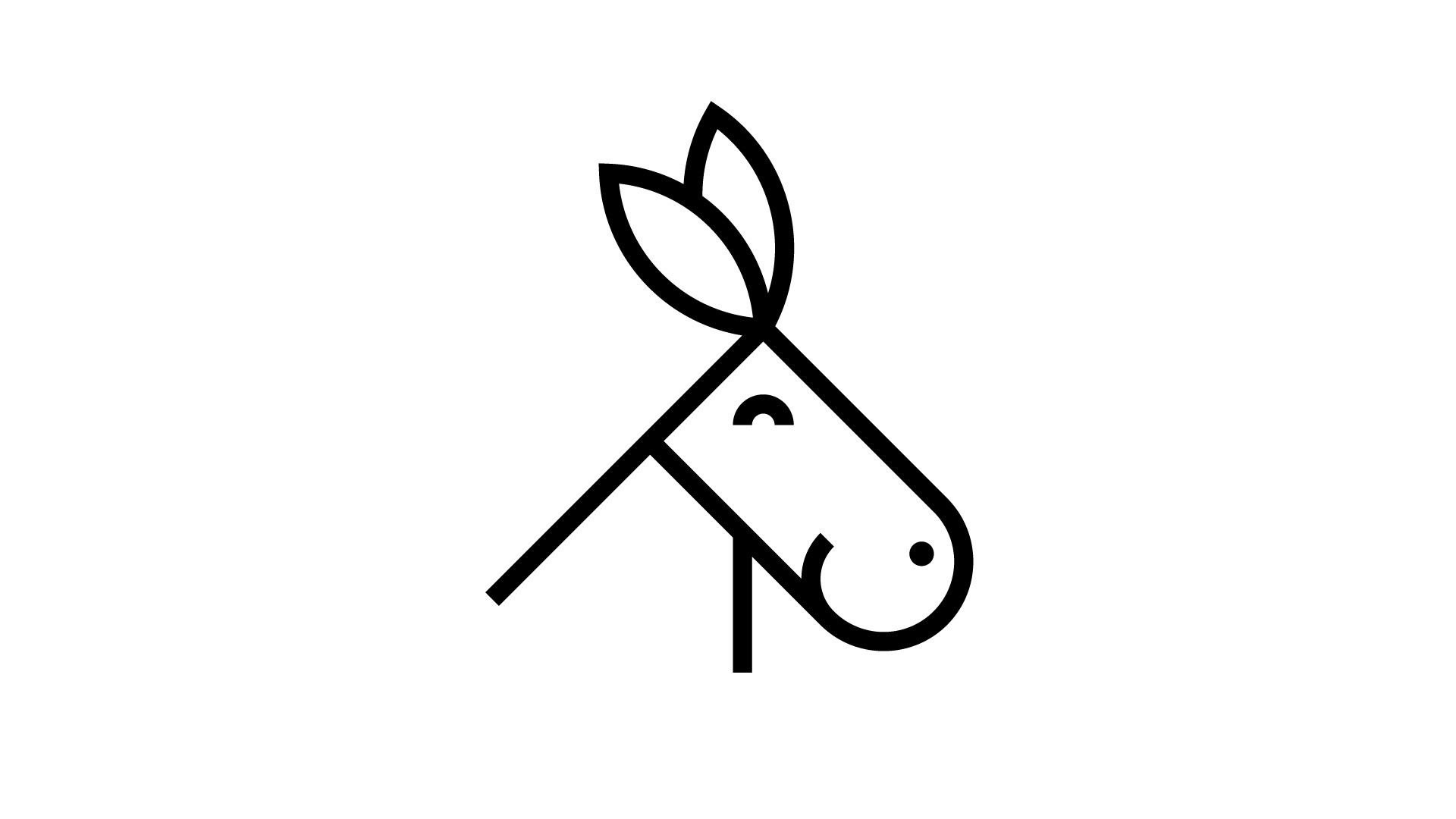
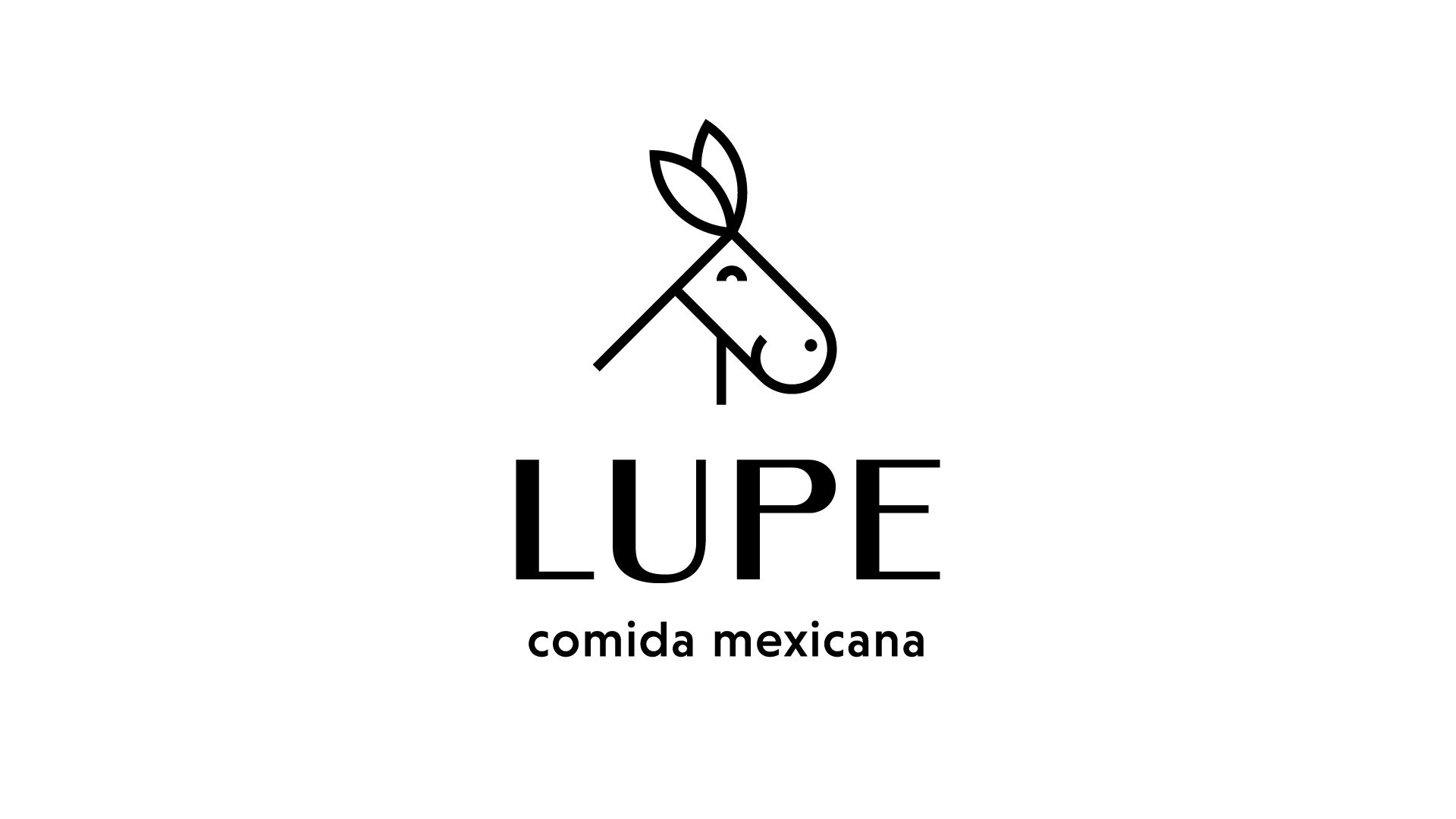
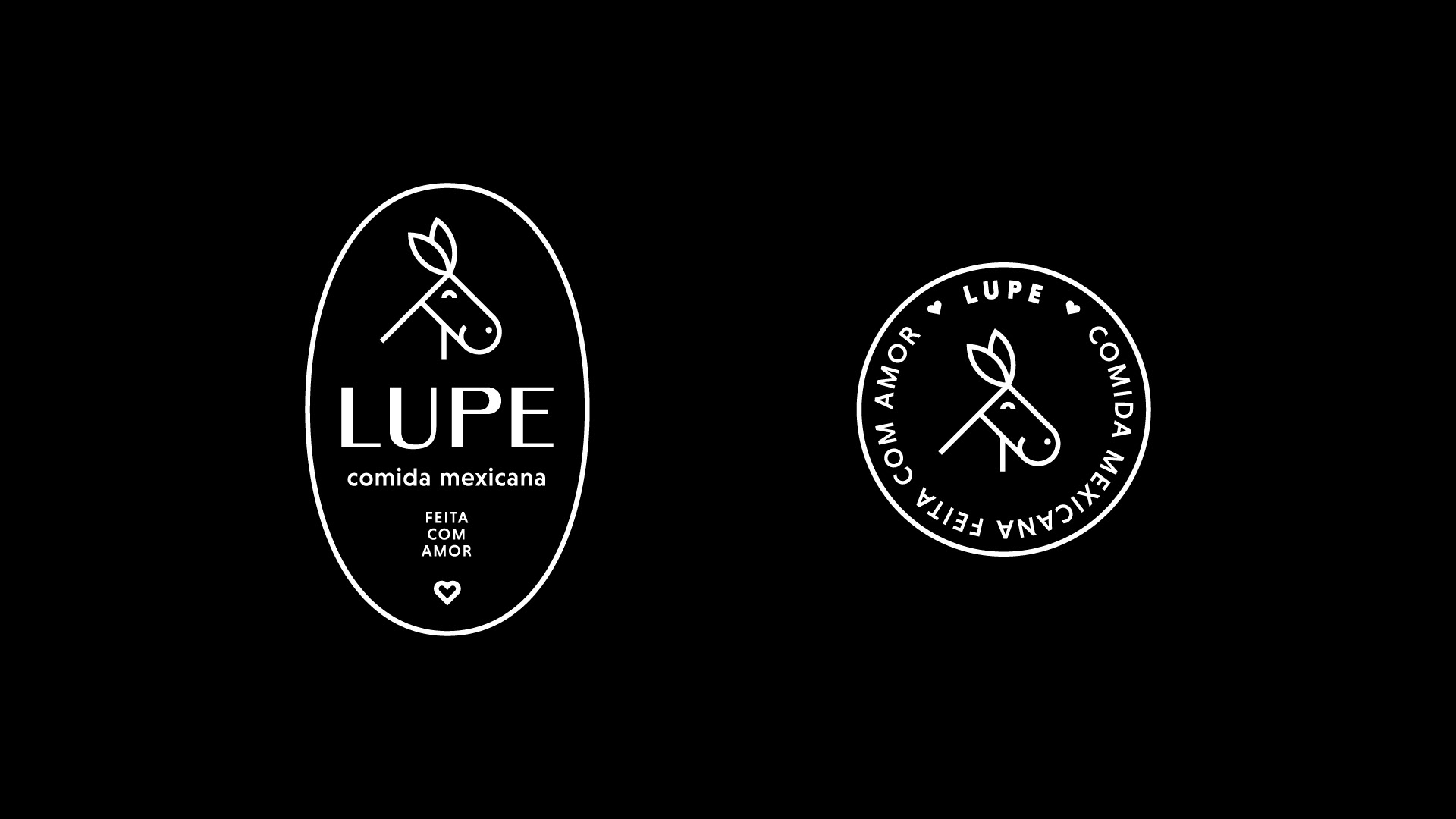
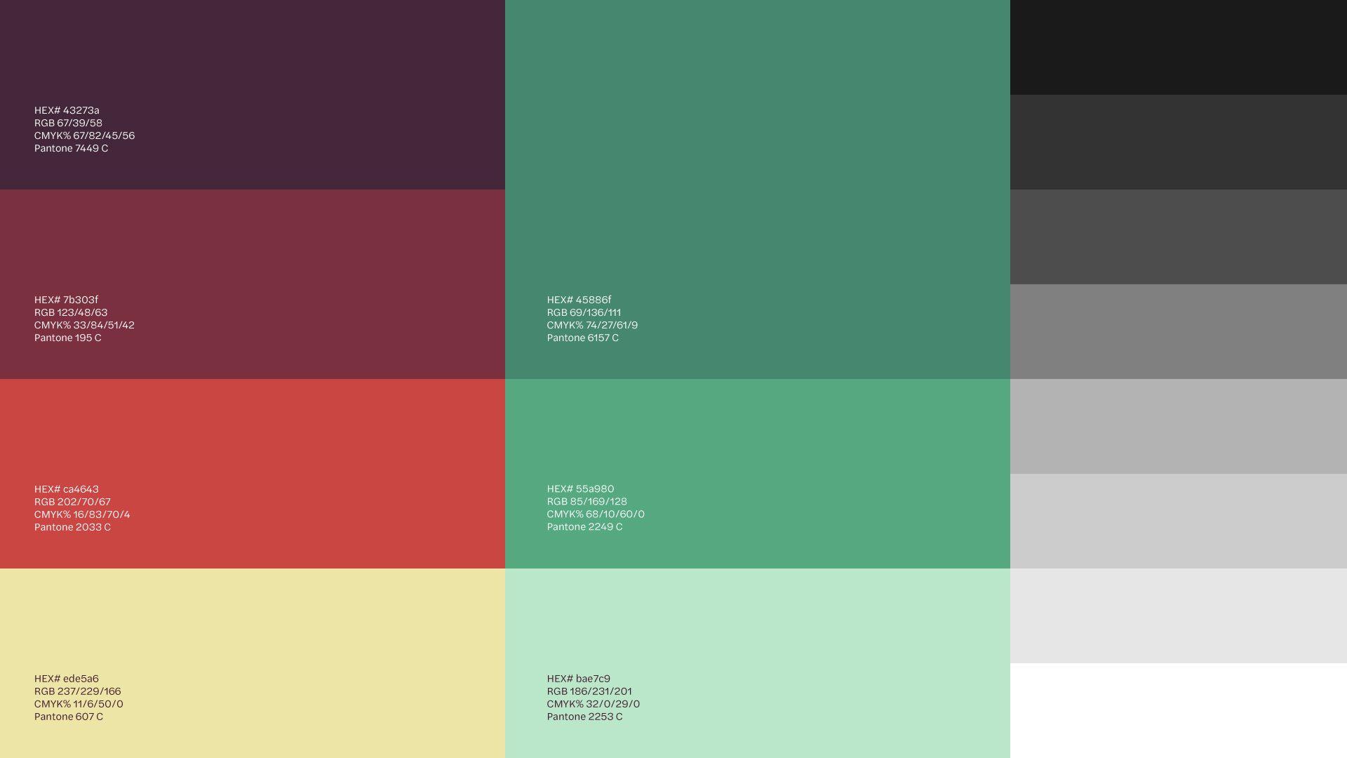
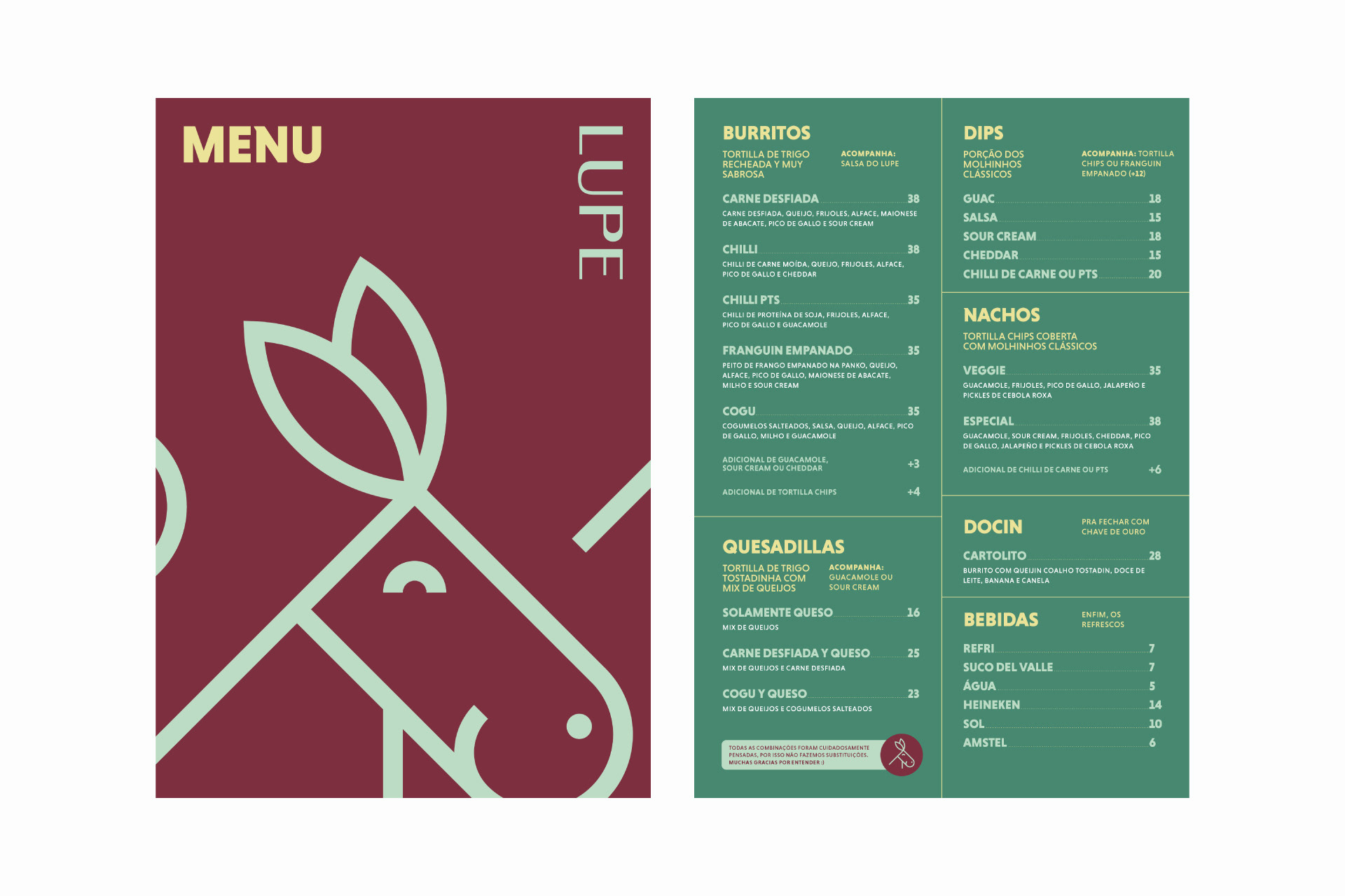
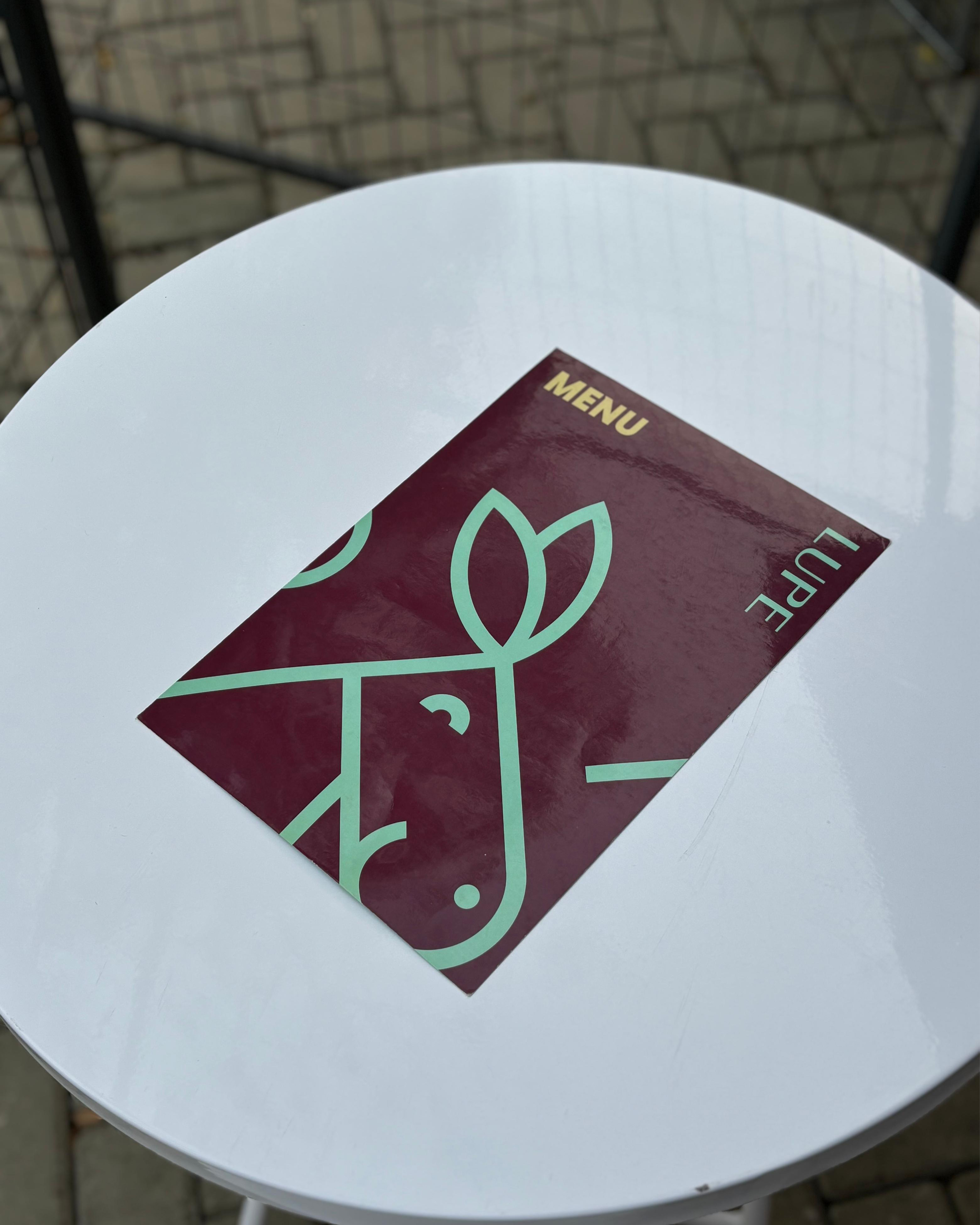
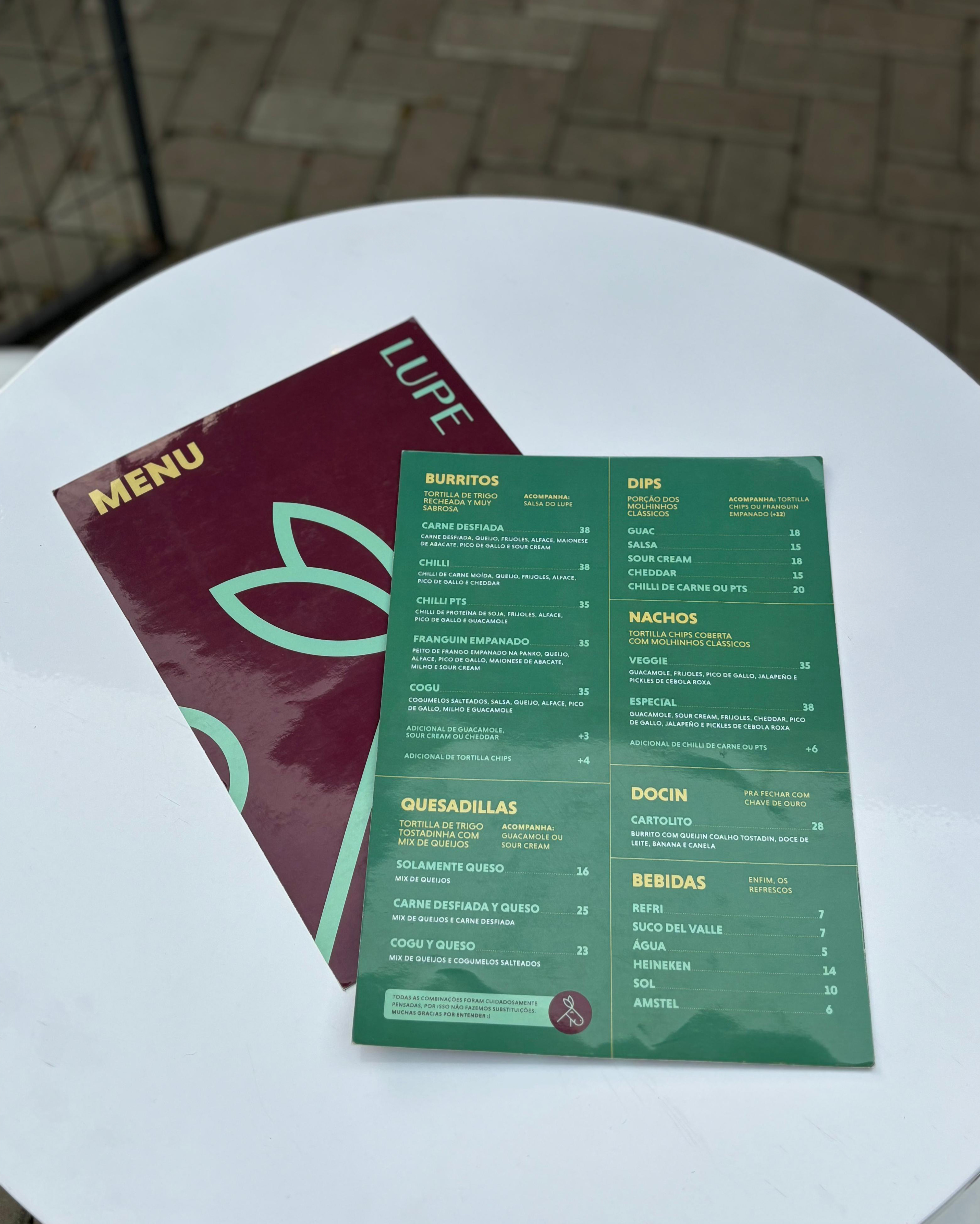
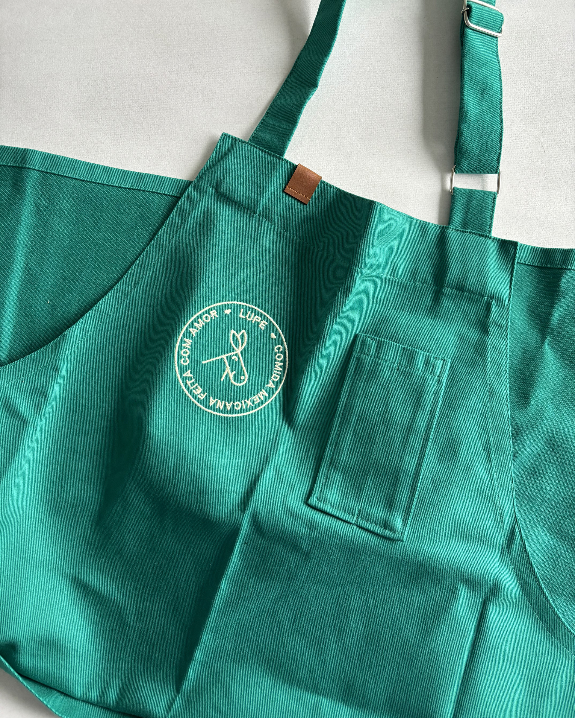
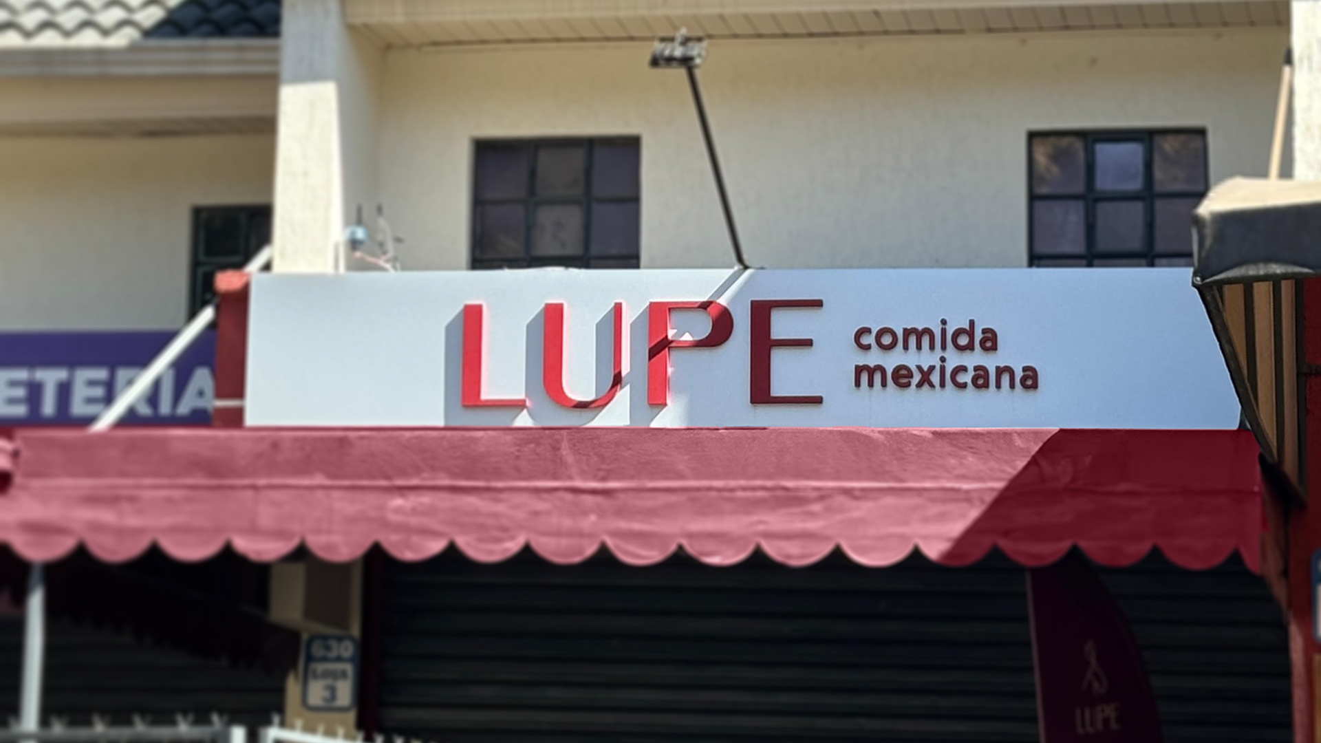
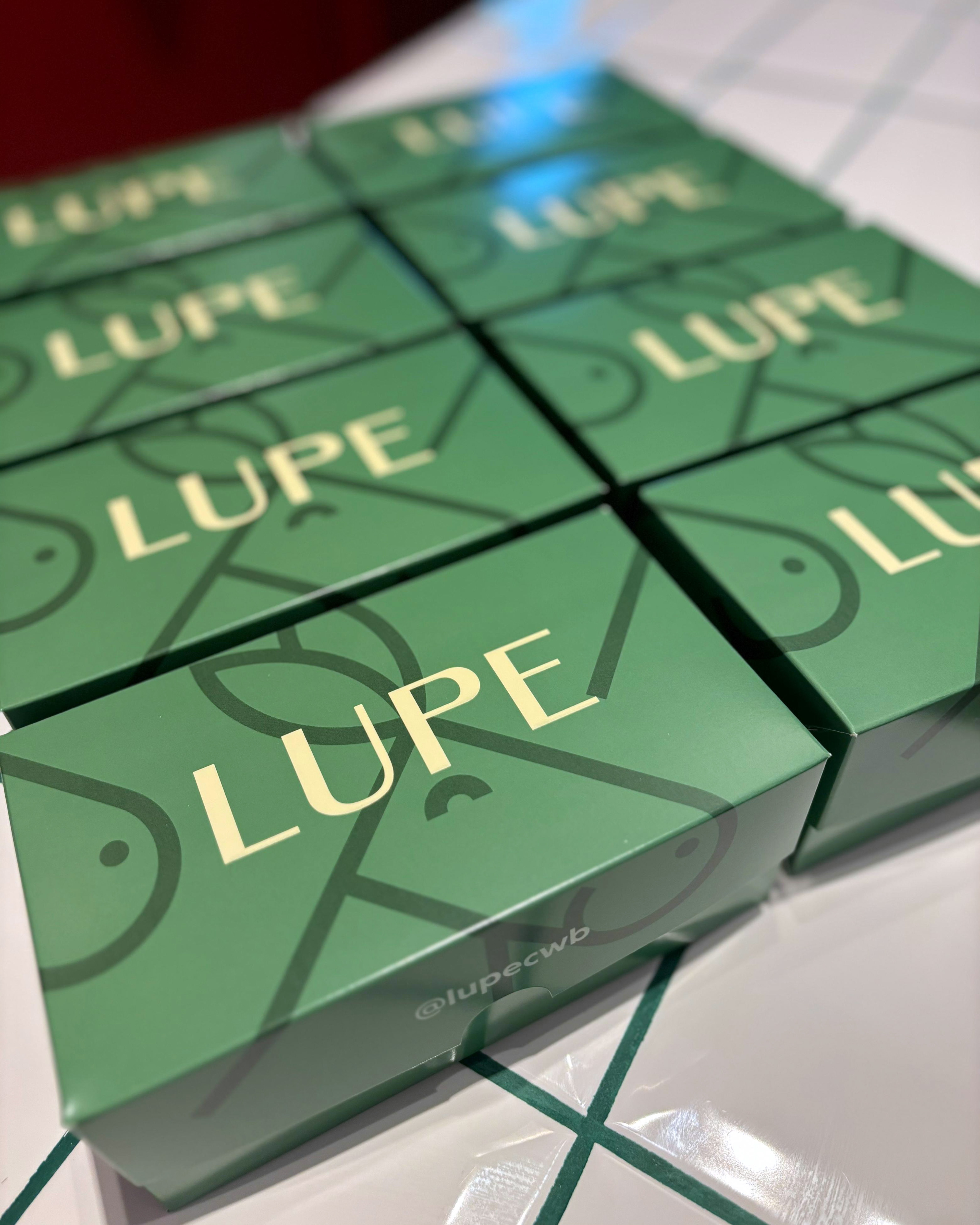
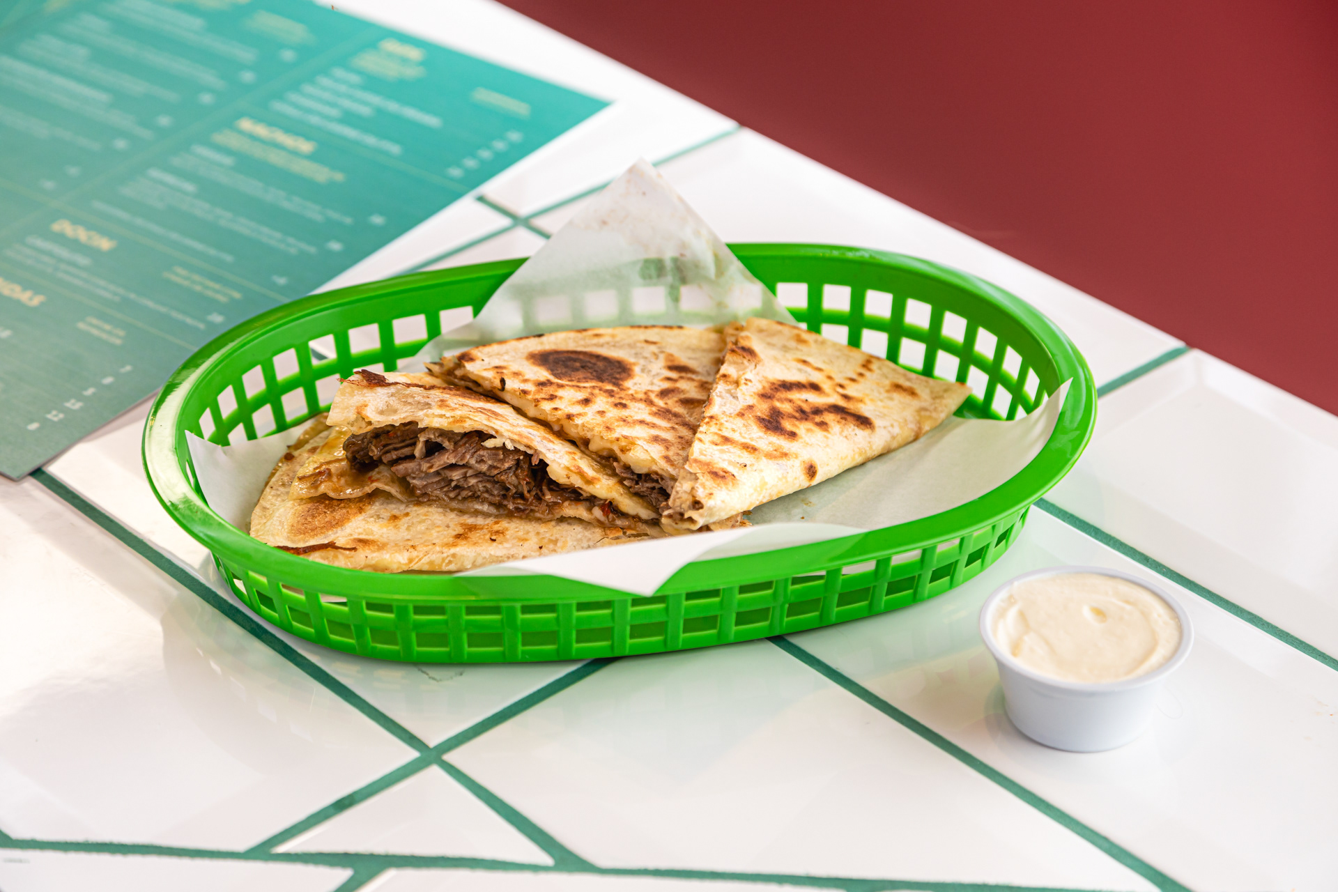
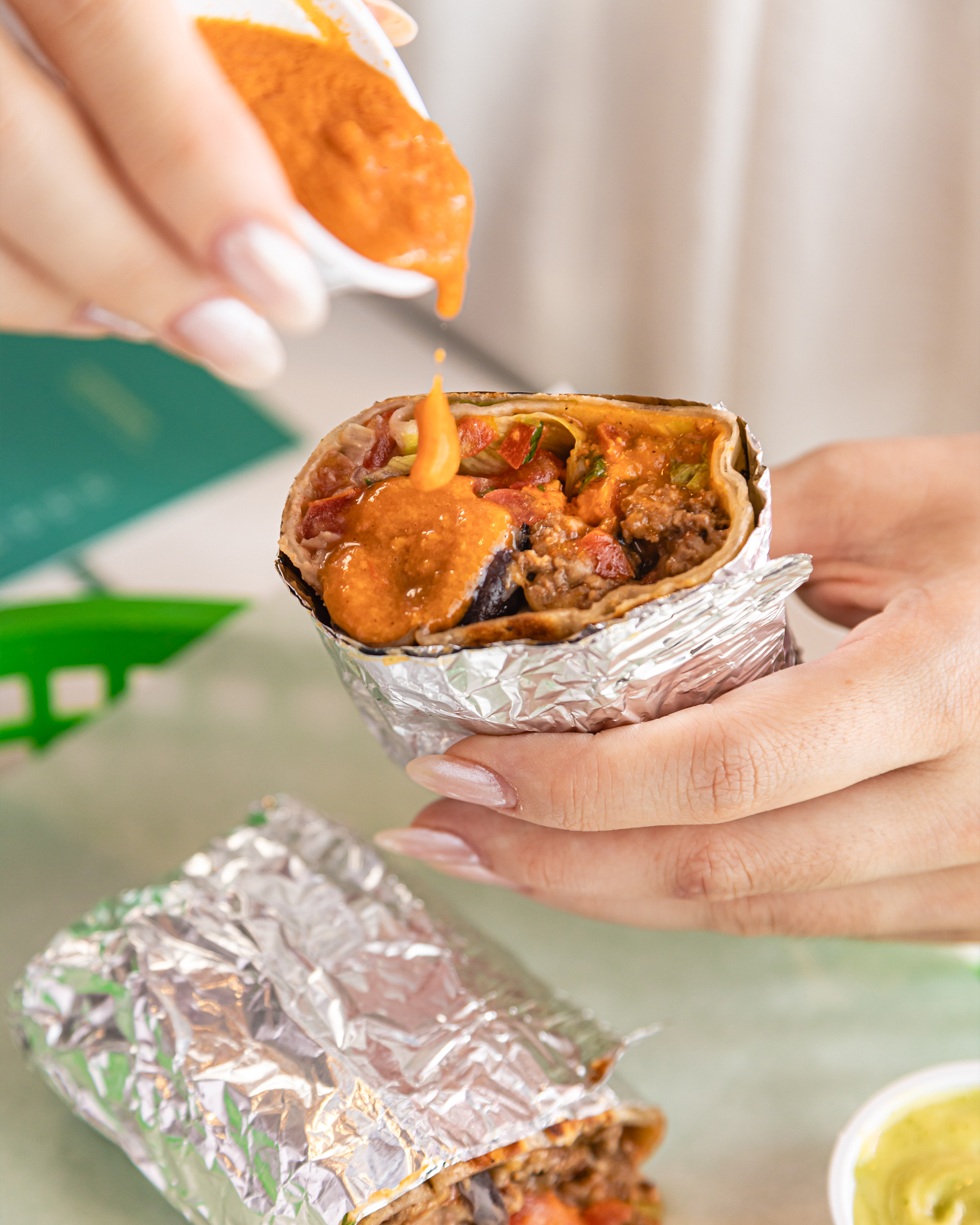
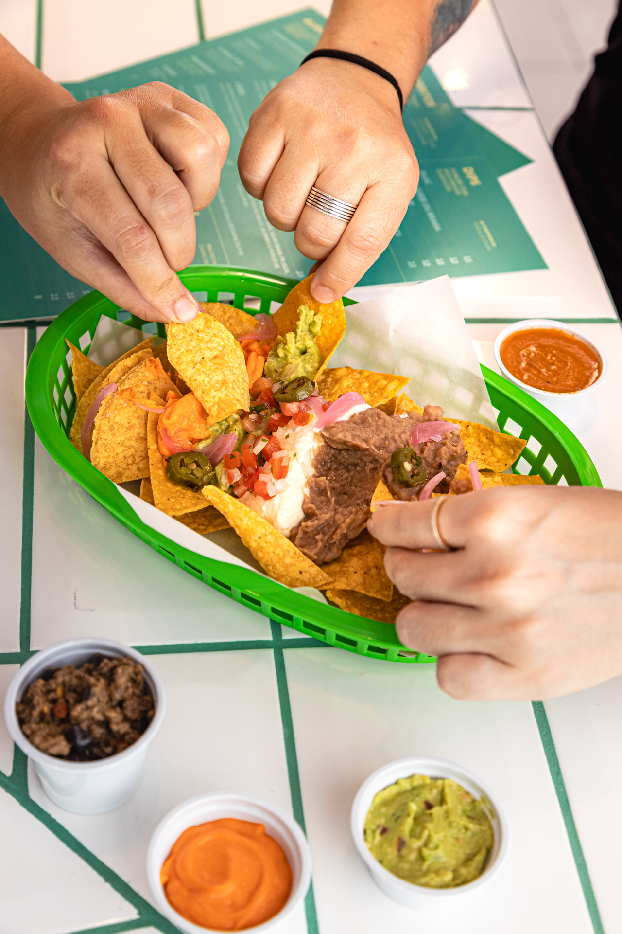
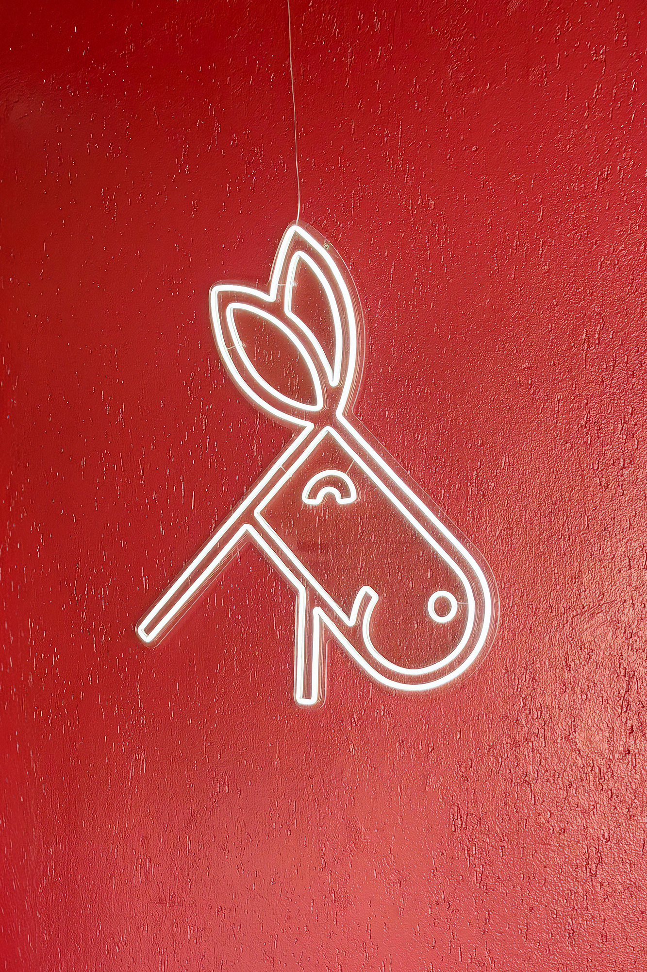
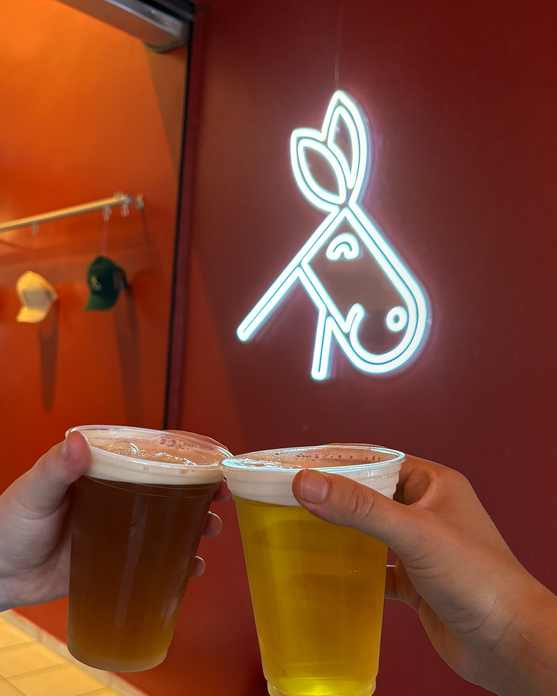
In 2024, I was commissioned by a chef entrepreneur to create the identity of her new street Mexican food restaurant in Curitiba, Brazil. With originality, the place brings a new vision to Mexican cuisine in the city, respecting traditional Mexican plates while adding a Brazilian touch, using cultural and local ingredients to create new flavors thoroughly. This specific project had decisive ideas from the client: she asked me to develop a donkey to represent the brand. The restaurant's place has a burgundy color on the wall and tilt, which can't change (property limitations), and she wanted a happy and lovely brand's personality.
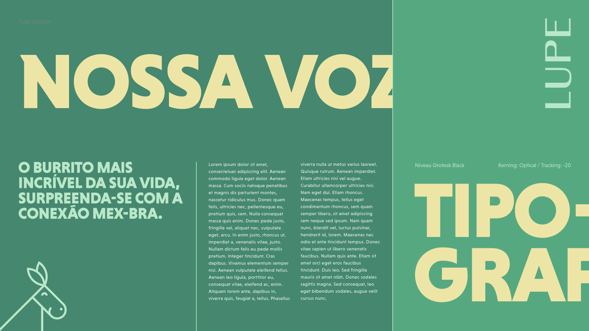
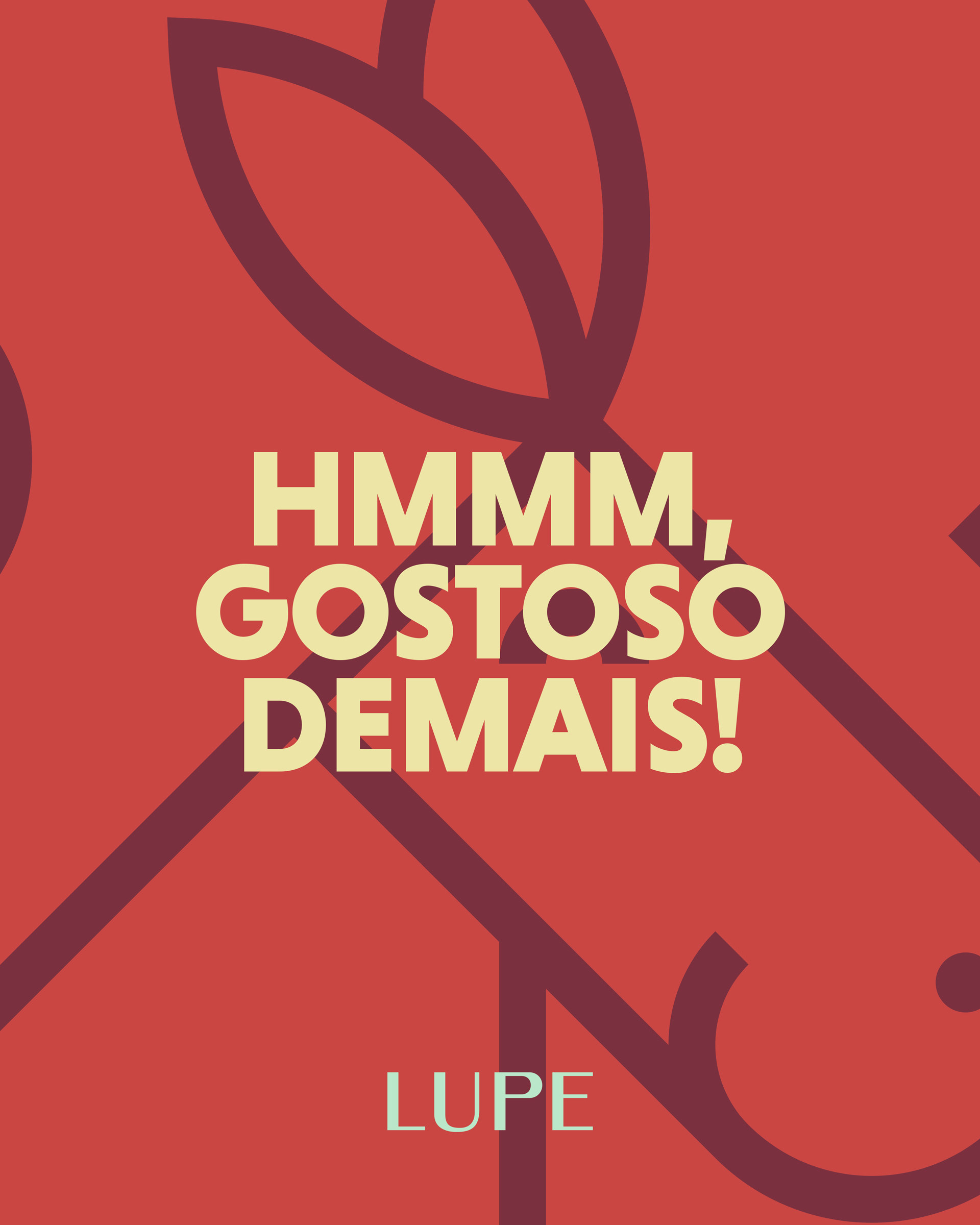
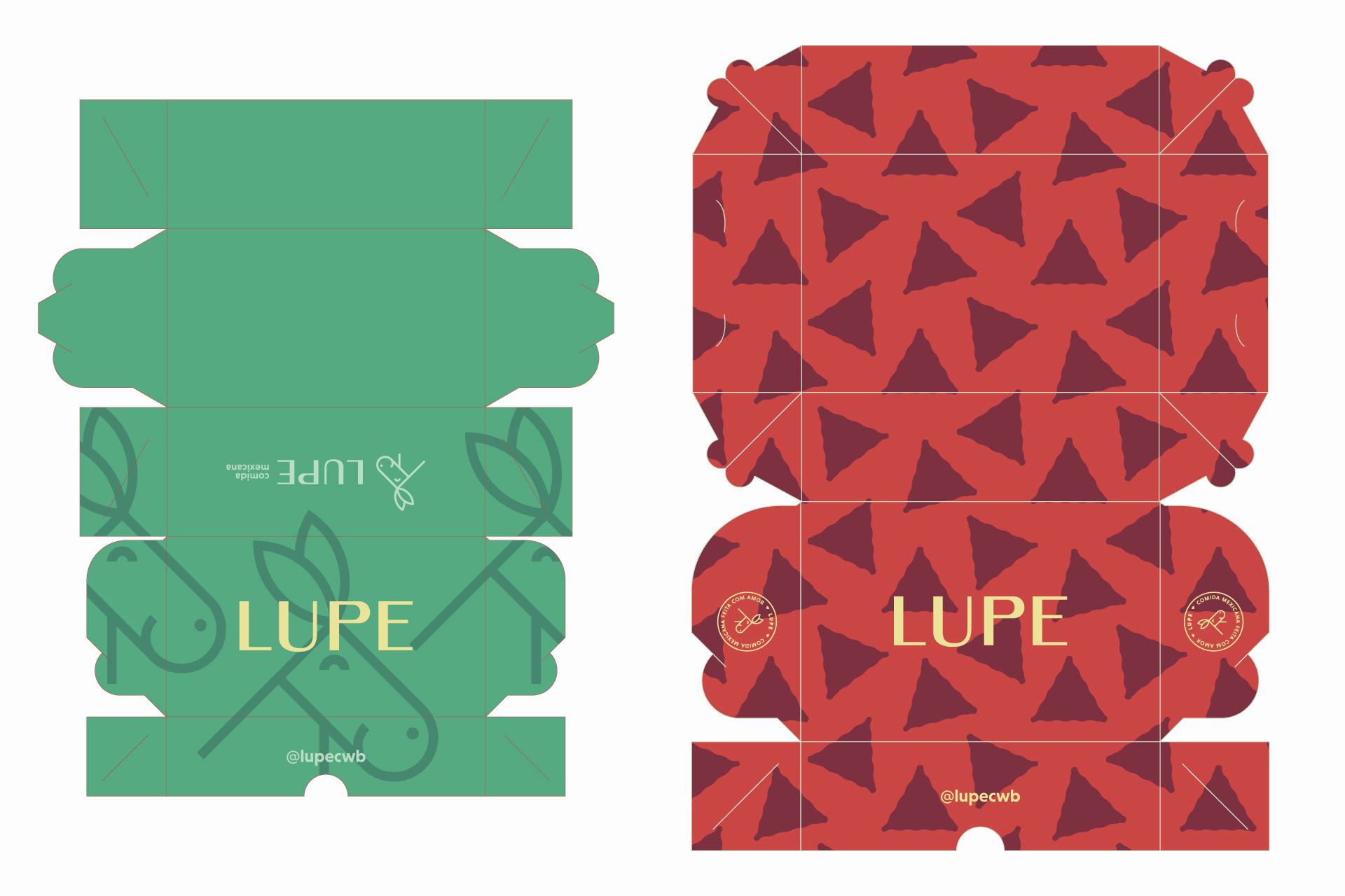
With those in mind, I developed a consistent brand, looking at the burgundy as an opportunity to be the darker color of a happy color palette, with tons that bring joy and incredible sensations over the food, the mascot is cheerful and friendly, generating an instant connection with the audience, the designed wordmark has some constrast in the letters, adding a slight funky touch to a geometric approach; finally, the Brand's typography choice is powerful and bold, impacting the copy communication and putting on a playful side in the layouts with even more contrast with the Brand's assets.
Creative Direction and Design: Sato Mateus
Food Photography: Gabriel Henrique
Restaurant Architecture: Elã Atelier